

Who is Masayuki Doi?
Masayuki Doi (土居政之) was born on
February 24th, 1976. He was raised in the Tokyo-adjacent city of Yokohama. His blood type is A.
After high school, Doi
attended a two-year fashion vocational school and majored in fashion design. A
lung sickness prevented him from entering the workforce immediately after
graduation; nonetheless, Doi's college, in his words, "hooked [him] up
with a big-name clothing company." However, Doi declined the offer because
his true desire was to be involved with games. He played and loved the original
Famicom Megami Tensei game in elementary school, so he applied for a job at
Atlus. [1]
 |
| Masayuki Doi is not approved by the ESRB |
Upon first joining Atlus, Doi began
work on Persona 2: Innocent Sin (1999), designing the tarot cards and coloring
character portraits. Afterward, he would be assigned to 2D background art in
Shin Megami Tensei: Nocturne (2003), Digital Devil Saga 1&2 (2004/2005),
and the two Raidou games, Soulless Army (2006) and King Abaddon (2008); he
would be bumped up to background design leader in Nocturne Maniacs (2004) and
says he contributed to the "worldview" design of Soulless Army in
particular, presumably having to do with period aesthetics. [1]
Doi’s big
"break" came as character design lead for the Trauma series. His
first Trauma task was to redesign the characters credited to Maguro Ikehata in
the original DS Trauma Center: Under the Knife (2005) for its Wii
remake, Trauma Center: Second Opinion (2006). He remained as character
designer for its sequels Trauma Center: New Blood (2007), Trauma Center:
Under the Knife 2 (2008), and the series' final
entry, Trauma Team (2010). After Trauma, he returned to Megami Tensei
work with
the ports of Persona 2: Eternal Punishment (2012) and Soul Hackers
(2012).
In the wake of Kazuma
Kaneko’s “evaporation,” Doi became the natural selection for the role of Shin
Megami Tensei IV’s (2013) character designer, which finally brought him his hard-earned recognition. In the follow-up to SMT4, Shin Megami Tensei IV:
Apocalypse (2016), Doi was responsible for both new characters and new demons;
he also contributed a handful of character and demon designs for Shin Megami
Tensei: Strange Journey Redux (2017). Presently, it is assumed that Doi is
working on design and art direction for the upcoming Shin Megami Tensei V.
Assessing Doi
As you can see, Masayuki Doi enjoyed a long tenure at Atlus prior to his emergence as the principal designer for post-Kaneko Shin Megami Tensei. Doi’s contributions in this respect have loomed largest in the public imagination these past few years, but with this history in mind we’d like to take a look further back, to a time when Atlus had yet to contract quite so tightly around their flagship series--in this case, 2006. It’s during the relatively brief but respectable run of the long dormant Trauma Center franchise in which Doi crystallized his chops as a character designer for the company, a period that receives little attention beyond what persists of the modest fanbase that formed around the series. And while the work produced therein is worth considering in any context, it’s particularly valuable as a source of insight into how that career has developed and even where things might have landed under different auspices.
With SMTV on the horizon and Doi’s involvement all but assured, we decided to trace that development over the full decade that separates Trauma Center: Second Opinion from Shin Megami Tensei IV: Apocalypse, in an effort to better understand the artistic evolution that has taken place. The results have been enlightening, to say the least! So without further ado, the first item on our agenda is...
With SMTV on the horizon and Doi’s involvement all but assured, we decided to trace that development over the full decade that separates Trauma Center: Second Opinion from Shin Megami Tensei IV: Apocalypse, in an effort to better understand the artistic evolution that has taken place. The results have been enlightening, to say the least! So without further ado, the first item on our agenda is...
I. A Second Look at a First Impression
 |
| Trauma Center: Second Opinion / カドゥケウスZ 2つの超執刀 |
Soren: As mentioned in the bio, Doi was taking over the Trauma reins from Maguro Ikehata, who has no other discernible design credits and an indistinct style to match. A pretty good opportunity for a young artist to showcase their ability, during the same year that Kaneko stepped aside to make way for another younger artist. That should be a decent launch to discuss his style.
 |
| Robert Hoffman, senior model |
Eirikr: Yeah. And that's the big one, describing his
style.
Eirikr: Yeah, as adaptations, most of them come off as
fairly simple. Not to get too ahead of ourselves here, but another key difference I think is there are more
shadows/highlights on faces in these older character designs compared to those from contemporary games.
Soren: They're pretty noticeable, yeah. They lend some additional volume that isn't as present in his recent work, compounded with less abstracted facial features. Doi was still, for example, drawing nostrils
for Second Opinion’s designs, something that one Mr. Katsura Hashino would have hated,
apparently. [2]
Eirikr: (laughs) That's right, those aren’t very cute.
 |
| Lashing and lip reading: Kaneko's Aleph compared to Doi's Little Guy and Richard Anderson |
Eirikr: On the topic of similarities, Leslie Sears also looks just like an S-link character.
 |
| We loooove them similarities: Leslie Sears and Persona 4's Kou Ichijo |
Eirikr: So, admission time. Did you also think Doi’s Trauma art was actually handled by Shigenori Soejima?
Soren: Yes, I even distinctly recall a conversation I
had on Giant Bomb about how Soejima had rescued the series from artistic
mediocrity.
Eirikr: And that same conversation was happening in other places besides Giant Bomb. An honest mistake. After all, Doi's name just wasn't
on the radar until Shin Megami Tensei IV--and how many people both actually
beat all of the Trauma games and paid attention to the credits? Not me.
Soren: Exactly. Plus during the period of Doi's Trauma
work, between 2006-9, the only two in-house Atlus art styles were Kaneko's,
whose is perpetually distinct, and Soejima's, whose Persona 3 and Persona 4
designs, to the ignorant eye, the Trauma characters definitely resemble.
Eirikr: It was quite a shock to eventually learn this
assumption was off-base. But to conclude the topic of Second Opinion, there’s
one character in the game who didn’t originate from Ikehata’s pen, and that’s
Nozomi Weaver/Naomi Kimishima. Since she’s a Doi original, she probably also
best encapsulates what was going on with his design sense at the time.
 |
| Naomi Kimishima's Second Opinion designs |
Eirikr: I guess Mother Harlot doesn’t count, huh? Anyway,
I’m immediately drawn to her feet. Though she’s in heels/platforms, they are
posed arched upward and facing towards the viewer at a flat angle, something
we’ll see more of in the future. Plus a rare look at Doi toes. This isn’t a
fetish, I swear!
Soren: Looks like he was hot out the gate with those.
The bold outlines around the eyes, in addition to the defined nostrils and
upper lip, are all present as well, though they'd unfortunately have less of a
shelf life to them.
Eirikr: She’s also got that exposed bra on her black
outfit. Cunning! On a personal note, I can confirm that Kimishima’s design was
successful at gaining the attention of at least one human being, that being my
cousin. Though normally not into art even remotely resembling anime, I’m pretty
sure at the time he called her “smokin’.” She’s probably half the reason he was
interested in playing the game! And so, Doi’s work began earning accolades
right out of the gate. Pretty... impressive?
II. Bloody Good Work
 |
| Trauma Center: New Blood / カドゥケウス ニューブラッド |
Soren: New Blood apparently came out in the West first?
Eirikr: By two months, it seems: November 2007 to January
2008. Only a year after the previous release, Doi’s New Blood art is a
noticeable evolution and refinement of the Second Opinion style. For example,
emphasis on facial details like defined nostrils, as you said.
Soren: Yes, and Doi's full range of facial eclecticism
is on display as well. The palette is subdued earth tones across the board, but
the designs are still incredibly distinct. The sheer number of portraits dwarfs
Second Opinion as well.
 |
| This baby is now 10: Feel Old Yet? |
Soren: That sweet mug contains multitudes. One glance and
you can feel the apex of Doi's artistic output flash before your eyes.
Eirikr: But okay, seriously, it definitely has to be
Professor Wilkins receiving a blowjob (note: don't worry, it's not literally that) from someone wearing Fuuka's trash bag
outfit (note: it's literally a trash bag).
Soren: Yeah, there just isn't much competition there.
One glimpse of that fellatious nonsense blanket and you can feel the apex of
Doi's artistic output flash before your eyes.
Eirikr: But okay, seriously, in all honesty it's probably
some version of Valerie Blaylock.
Soren: She hits all the major notes for this period of
Doi's art, I think. For starters, his fashion chops are in effect for just
about any outfit you catch her in.
Eirikr: Her frilly shirt is as distinct as the fact that
it's shown as too tight around her chest for "some" reason. She also has some nice belts.
 |
| Valerie Blaylock, proud owner of three separate ensembles |
Soren: It's pretty impressive that outfit works with the
lab coat. Also carries across the subdued palette that New Blood employs nicely.
Eirikr: She looks like someone you might encounter in real life, which is not something you can often say about characters in Atlus
games. But I mean that as a compliment.
Soren: Yeah, the overall sense of restraint comes
through nice and clear here. And building on the diversity of the cast, we have
maybe the only black protagonist in an Atlus game this side of Revelations: Persona (and thus the only one worth considering).
Eirikr: Yeah, that’s a great point! The diversity seems
like a real power play to appeal to the North American audience. I would
suppose they got burned by sales figures after this and a similar attempt with
Strange Journey failed, as they’ve since retracted into their Japanese shells.
But besides Valerie, which designs do you think are the standouts?
Soren: Good question. I really like the ones that you
can immediately tell would never appear in a modern Atlus game, like Dr. Chen
or Secretary Mendez.
Eirikr: Yeah, in addition to being an officially designated "No Nostril Zone," Atlus Japan subscribes to the Logan's Run school of age politics. But as to the point
about earth tones, everyone has realistically-colored hair as well.
Soren: On that note, the masked villains immediately
stand out due to their cotton candy flavored hair, a contrast that wouldn't
really work in the next console Trauma title.
 |
| Doctor Chen and Secretary Mendez |
Soren: The first and probably best. New Blood has it
all.
Eirikr: Even though they are pretty ineffective in this
game. I've never even played the damn thing and it was still obvious who they were.
Soren: (laughs) Guess it's still a Trauma Center game. And to elaborate a bit, the racial diversity of the cast really is strong here.
Eirikr: Yes. Is this the Atlus game with the most black
people? But it's beyond that, even.
Soren: Obviously a credit to the scenario, but Doi
handles it with more tact than you would reasonably expect from a game
like this. No comedy afros or anything. One of the things that also took me by surprise as I played through it earlier this year was the abundant Latinx representation, and not just within (fictional war-torn Latin American country).
Eirikr: They don't look like unfortunate stereotypes.
They look... normal for this art style. Even game show host Guy Davidson is
pretty subdued compared to other foreigner stereotypes in the medium.
Soren: Yeah, and he notably has a host of less
exaggerated counterparts to offset the effect.
Eirikr: Though Chandler Forbes could probably slice
cheese with that chin.
Soren: The kid is ready to do some damage; also
basically a Navarre prototype.
Eirikr: Yeah. Cynthia Kazakov is the requisite deep
cleavage babe, I guess, but she appears to be the only one. It doesn't appear
too out of place if you imagine this as the modern medical drama it's aiming to
be.
 |
| Cynthia Kazakov and John Q. Sexman, another universe's primo shipping pair |
Soren: She seems quaint compared to other examples in
the Doi oeuvre.
Eirikr: Plus there's Sexman.
Eirikr: Plus there's Sexman.
Soren: Yes, Sexman is in the house.
Eirikr: Voted the world's sexiest impoverished video game man
of the decade.
Soren: A little something for everybody, that's the
promise of Sexman. Doi also has a habit of modelling faces on real people
(as would happen in Shin Megami Tensei IV with Walter and Jonathan), so there may have been some of that going
on in New Blood.
Eirikr: Yes, I was going to mention that next. Erik Hayes
gives me a Tom Hanks vibe, although huskier. Likewise, Nilsen reminds me of
someone whose name is on the tip of my tongue.
Soren: Agreed on Hayes. Couldn't quite place Nilsen,
though.
 |
| Clockwise from top left: Nilsen, Marshall, Quatro, and Hayes |
Eirikr: George Marshall is Jamie
Foxx-esque.
Soren: They look enough like real people that we can at
least make guesses, which is something.
Eirikr: Yeah. Irene Quatro, Cate Blanchett. They aren't
dead ringers but everyone looks distinct with regards to face shape and
features. Doi was clearly using some reference models.
Soren: No doubt. Unfortunately, New Blood never received
an art book, and we're not exactly drowning in interviews on the subject.
Eirikr: A shame. Looking at them now, I love the wrinkly
details and shadows on Prof. Wilkin’s and Dr. Hoover’s faces.
Soren: Doi could draw the shit out of an old guy, and
still can to an extent.
Eirikr: Rousseau sort of looks like the mafia prototype design for Tayama.
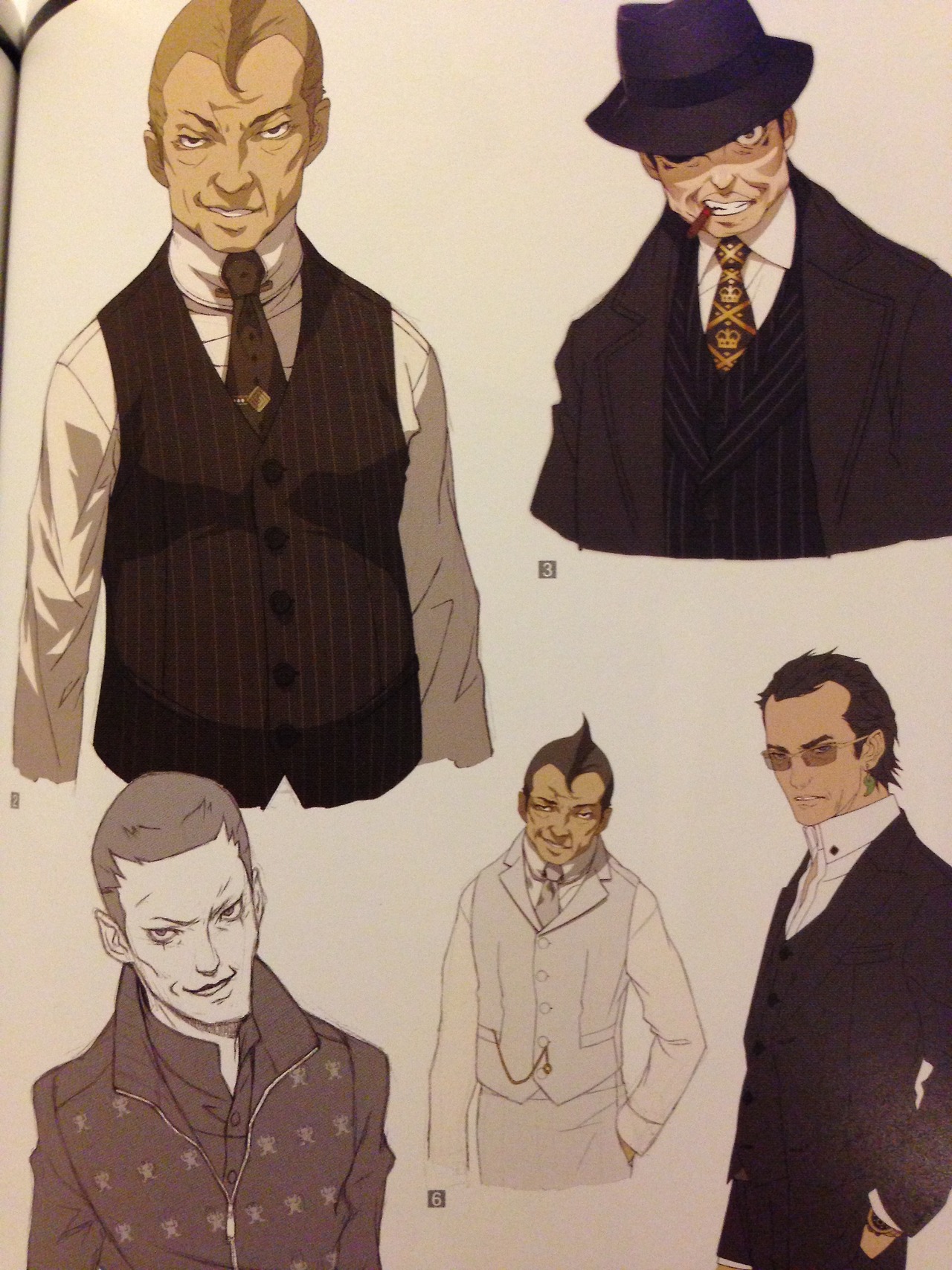
Soren: Yeah, same expression, swoop etc.
Eirikr: He needs more old guys and gals to draw.
Soren: Incidentally, the cast of Shin Megami Tensei IV is like, half
middle-aged or older men, something that Doi even comments on in the game's artbook. He was probably in his comfort zone there. Definitely
bring that back.
Eirikr:
That's true, I never thought about that before.
Time will tell! But one more thing about New Blood I want to mention as a
brief
aside is that the game is one of the few to feature my home state of
Maryland,
albeit a very... Japanese version obviously lacking for research or
verisimilitude. It’s apparently the location of Caduceus USA’s HQ,
possibly in reference to the internationally famous Johns Hopkins hospital complex, a
jewel in the Maryland crown. Unfortunately, I couldn’t find a Japanese
source
to confirm Maryland was also in that version, but I would assume so, as
the
character names are identical between versions.
 |
| Good ol' Annapolis, down by the Chesapeake... River?? |
Soren: I do wonder how it worked, with New Blood
releasing stateside before it hit Japan. Maybe it was designed to be more
appealing to a Western audience, hence the subdued designs, racial diversity,
etc.?
Eirikr:
Yeah, like, how much House did the team watch? I
can appreciate the crab cakes shoutout, but if this is supposed to be
actual Maryland, some actual research into the geography would have been
nice. The state capital Annapolis is the only city specifically
mentioned, but if it’s riverside instead of
bayside, that means there is no Chesapeake Bay, which means no crabs,
which
means no crab cakes. And apparently the Marylanders in this universe are
way
into hockey instead of baseball or football. [Eirikr's note, 6/11/18: The previous statement was written well before the recent Stanley Cup victory of the Washington Capitals. Regardless, I still don't care about hockey, vicinity and solidarity attempts by the Orioles (R.I.P.) be damned!]
Soren: In 2007 or 2017, this sort of cultural research has apparently never
been Atlus’ strong suit.
Eirikr: Yeah, why take the time to learn about other
cultures when you can just make everything look Japanese, like the appearance of fake Maryland's urban sprawl? I mean, that's the default everywhere, right? But before we get too
cynical, let’s move on!
III. Under the Radar 2
 |
| Trauma Center: Under the Knife 2 / 救急救命 カドゥケウス2 |
Eirikr: Of note for Under the Knife 2 is that it reuses a lot of assets.
Soren: Yeah, the main cast, with the exception of Derek
and Angie, are recycled entirely. Otherwise there are about a dozen new faces.
Eirikr: And some more diversity, as Derek and Angie go to
Africa on some humanitarian mission.
Soren: Yes, and right away we meet Derek's new protege, Adel Tulba, who has a luscious green mane. So we're basically back to the Second Opinion
wheelhouse in terms of stylization.
Eirikr: Yeah, like Leslie's or Kimishima's hair, the
restraint shown in New Blood is gone.
Soren: It's at least a practical decision, since designs
in the style of New Blood would clash with the recycled assets.
Eirikr: Plus Under the Knife 2 has a healthy dose of the original's
SyFy Original Movie fantasy science that was cut back a bit from New
Blood.
 |
| Get up to get down with the Count: Reina Mayuzumi and Heinrich von Raitenau |
Soren: Yes, they go to town with the Kyriaki hijinks in this one. It's all around a return to the roots. So basically everything we
covered in Second Opinion applies here, albeit at a lower resolution. However, some new
characters like Reina Mayuzumi and Bram Stoker's Heinrich von Raitenau
introduce an additional element of visual goofiness that would expand later on.
Eirikr: And boy would your face eventually be red if you spent too much time reflecting on Reina.
Soren: No kidding. This image is also
magnificent, Trauma Center cinematics at their finest.
Eirikr: That's how anti-nostril supervillain Hashino-Baba was born. And Heinrich looks like he should be bossing around Miles Edgeworth if not fighting a Belmont.
Soren: The guy isn't taking any extraneous steps to to disguise
his villainous agenda, to say the least.
Eirikr: We've mentioned the one and only Dr. Derek Stiles
but haven't given his designs a proper analysis yet. But there's a reason for
that--we wanted to wait until we could compare and contrast them all at once.
Soren: Yeah, he's the leading man and probably the face
that most associate the franchise with, despite only maintaining his starring
role for about half the series. And luckily enough, his designs in Second Opinion and Under the Knife 2 give us a decent look at where Doi was at both periods.
 |
| Derek's Initial Styles: Ikehata's Under the Knife version (left), Doi's Second Opinion prototype (center) and final (right) versions |
Eirikr: Not only that, you just found a promotional image
that has what appears to be a prototype Derek.
Soren: This thing is bizarre. The basic design is
intact, but we get a glimpse of an earlier, slightly more toned down style. For
starters, dialing back the severe expression was definitely the right call,
since the guy is kind of a dork.
Eirikr: The whole thing looks drab. He's also wearing a
bright white Caduceus shirt that doesn't appear in the final game.
Soren: Looks to be the same one he's wearing in
Ikehata's design, and taken with the less ostentatious headphones, it's
definitely hewing closer to his original appearance. No surprise, considering
it was probably drafted early on.
Eirikr: Yep, I was just going to say it looks like a more
direct adaptation of Ikehata's.
Soren: That checks out then. The eyes and the duller
color scheme underwent some changes, and the shading from the neck down is a
lot more involved in the final product, but that seems to be the long and short
of it.
Eirikr: Looking at the proto and the final side-by-side,
besides the costume change, the real difference seems to be shading and the
duller color, as you say. As for the Second Opinion Caduceus design, Derek's
yet another year 2006 Atlus protagonist using a cylindrical mp3 player, after
Persona 3's of course.
 |
| Under the Knife 2's "Adult Contemporary Derek" |
Eirikr: Derek already has a smile on his face from the
thought. Though maybe also because he knows he's going to be mistaken for a
Soejima creation for years to come. Better networking opportunities there.
Soren: The day had not yet come when anyone would
actually know what a "Masayuki Doi" is. BEHOLD! But one day, when this series is completely sunk and your best days are behind
you… Otherwise there's not much to say about the Second Opinion design beyond what applies
to the leap from Ikehata that we covered above. His Under the Knife 2 incarnation, however,
brings something new to the plate, representing a more significant departure
from his DS design, now that Doi had more or less come into his own.
Eirikr: Yeah, Under the Knife 2's just has a much more natural flow
to it, unlike the stiff Second Opinion art. Easy to see Doi was undoubtedly feeling a lot
more confident at this point. However, here we have a clear case of Nostril
Erosion.
Soren: His hair in particular is so much less of
an awkward, spikey mass now. As for the nostrils, what little we see here is
basically the last gasp.
Eirikr: But the folds on his jacket and the overall
shading are pretty much what we could term "Contemporary Doi."
Soren: That sums it up nicely, and as such it's a solid
encapsulation of his Under the Knife 2 fare. The palette and skin tone achieve much the same
effect.
Eirikr: Even though Under the Knife 2 basically kept the
Second Opinion style intact, a promotional image released for the game offered
a glimpse at the near future.
Soren: Yeah, it turned out to be a harbinger of things to come in terms of both style and tone. While pretty tame as far as these things go, a cheesy bikini pinup of female lead Angie is still a departure from the approach of earlier entries.
 |
| PLEASE BUY OUR GAME |
Soren: Yeah, it turned out to be a harbinger of things to come in terms of both style and tone. While pretty tame as far as these things go, a cheesy bikini pinup of female lead Angie is still a departure from the approach of earlier entries.
Eirikr: The good old days, before Atlus charged extra for
this kind of stuff. I remember this image appearing in an old Atlus Faithful
email, though it seems to have been deleted. And yeah, it’s not just that it’s
Angie in a bikini, but that the style is a lot simpler. Less, or at least a
different type of highlighting and shading. Her irises are way bigger and she
has little dot nostrils, not the clearly outlined ones that appear even in her Under the Knife 2 art.
Soren: Yeah, thinner lines, different coloring (or does
she have a tan here?), lines on her cheeks to suggest blush, and listening to
headphones so you know she's a stylish anime gal.
Eirikr: She's owning that "oh, didn't see you
there" Youtuber faux-bewilderment cliche, too.
Soren: No kidding. Her hair even has that line-riddled,
paper-like quality to it, all features that characterize Doi's style for the
final entry of the series.
IV. Taking One for the Team
 |
| Trauma Team / HOSPITAL.: 6人の医師 |
Eirikr: I'll start with an anecdote: I hate Hank Freebird and his stupid squinting face. So the game was released in May of 2010, right?
Soren: Yeah, looks like it came out here before Japan as well.
 |
| Hank Freebird |
Soren: Incredible. The content of the Strange Journey emails was
simply too scandalous for the teen population.
Eirikr: Atlus would be in hot water with parents if
Little Johnny was allowed to play it and access a very specific quest on a very
specific path that has a penis monster.
Soren: As for this other game, which unfortunately did
not retain its Japanese title of HOSPITAL: 6 Doctors...
Eirikr: More like St. Nowhere, because that's where the
series went after this release.
Soren: Hank Freebird's ill-fitting coat just wasn't
enough to move those copies.
 |
| Could have been worse! |
Soren: Yes, and I think the Caduceus Database sums up
the new direction succinctly: “The events of the game are told in the style of
a Graphic novel, with character art in the style of Anime." With helpful links
to the Wikipedia pages for both concepts, of course.
Eirikr: (laughs) Yeah, couldn't have said it better
myself. I need that on a
bronze plaque.
Soren: It is supremely evocative. The original Japanese box art does a sterling job of communicating the new direction as well; beyond
the comic panel framing, we can see that Doi has settled completely into the
style first glimpsed in that saucy Under the Knife 2 wallpaper.
Eirikr: Yes, it is undeniably character art in the style
of Anime.
Soren: With the busty heroine leaning over to give you a
good look at her marketing assets, also in the style of Anime.
Eirikr: And if they didn't work, there's always these
promo cards of the token Japanese girl, whom we’ll get to in more detail in a
moment. Like, if this game wasn't made by Japanese people, she would come off
as stereotypical.
Soren: Yeah, I'm not sure how practical that kimono would
be for performing an endoscopy.
 |
| ...PLEASE FOR THE LOVE OF GOD BUY OUR GAME |
Eirikr: Well, good thing Doi also drew her for those aforementioned cards in different outfits, in the style of Bathing, Undressing, and Sexy
Nurse.
Soren: He covered the whole gamut! Meanwhile CR-S01,
inexplicably voiced by Nolan North, looks like a melange of Persona protagonist
concepts.
 |
| Chie and Yukik... um, we mean Maria Torres and Tomoe Tachibana |
Soren: Yes, Doi's pigeon toes become a lot more
prevalent at this point.
Eirikr: He's also wearing, like, long johns.
Soren: It's like his special prison onesie, or
something? Definitely a look.
Eirikr: But what's obvious about Trauma Team right away
is that it's trying so hard to pander, as it was a series in serious sales
decline.
Soren: Yeah, and like you said, the shift can probably
be attributed to chasing those evergreen Persona bucks.
Eirikr: And amazingly... it didn't work.
Soren: It was an admittedly awkward fit for a series of
medical dramas, goofy as they were, but it really seems to have failed
spectacularly.
Eirikr: No matter the volume of Hank Freebird emails
Atlus tried to gorge us with, not enough people cared. Not boobies, not obvious
visual similitude to Persona, nothing. So pandering doesn't always print money.
Soren: An important albeit short lived lesson only
months before the acquisition of Atlus by Index co.
Eirikr: If you can't equal Persona, just make more
Persona. And speaking of Persona and Trauma Team…
Soren: Tomoe and Maria are, incidentally, the standard
bearers for Doi's artistic approach this time around, their likely Persona
influence, among other things, speaking to the demographic targeting at play.
Eirikr: The two of them are incredibly blatant examples,
on multiple levels. If they aren't somehow based on Persona 4's Yukiko and Chie, it
would have to be one of God's cruelest jokes.
Soren: Yeah, a baffling turn for anyone who ever mixed up their Soejimas with their Dois. The promo cards of Tomoe speak for themselves
in terms of pandering, and Maria manages to fulfil much the same function
while at least looking less like a teenager.
Soren: Though if that didn't do the trick there's always
her gratuitous post-shower scene, which you'll find without much trouble
anytime you go fishing for images online.
 |
| Maria and Tomo... dammit, Chie Satonaka and Yukiko Amagi |
Eirikr: Yeah, that post-shower portrait shows they had
the utmost confidence in the broad appeal of Maria's character. The same
confidence that appears in just about any other alternate art and poses for
her.
Soren: I guess it's worth noting that no one dons scrubs
at any point in this game, but they might have looked ridiculous if they had.
Eirikr: Who needs scrubs when you have an extremely expensive silken traditional dress?
Eirikr: Who needs scrubs when you have an extremely expensive silken traditional dress?
Soren: They really lean in to the traditional Japanese angle for Tomoe, almost like a parody of Yukiko's nadeshiko trappings. She also gets a less notorious bathing scene in apparently her first appearance (which is accompanied by cherry blossoms, obviously).
Eirikr: What, are you serious? You are. Oh my god.
Eirikr: An idea posited by that otaku book I read was that nationalistic themes, or I guess what we would call “stereotypical imagery,” are popular ploys to that particular demographic in Japan. And like you said, it's the "nadeshiko" image in play here.
Eirikr: Yeah, the references are too specific in that
linked video, like the 8 million gods. Hey, they had to try and sell the game
in the home market, too, even if they, you know, didn't. But they tried, dear
Lord, they tried. Like with those cards.
 |
| Traditional Flavor™ |
Eirikr: Yes, not even art of a Japanese-style wet t-shirt
contest was enough to save Trauma Team. But on the subject, Tomoe's promo cards
display another nadeshiko element: a modest cup size. I'm pretty sure I read about this in an ancient J-List newsletter (years before the site dropped the pretenses of being a general Japanese goods store instead of 90% porn), but the ideal Japanese woman supposedly
has around a Japanese C cup (B by Western bra measurements), which is about what Tomoe has (compare her to Maria or the
other female cast members). For example, Hitomi Tanaka is not nadeshiko and I don't think I need to link her to explain why. This is all oddly specific I know, and I'm not making it up I swear, really, it's a thing, but keep this in mind whenever you see depictions of
Japanese women in games or anime--usually the bustiest one is not the main
heroine, nor is the tallest, etc, and it's all about appealing to the general standards of Japanese men. But moving on to the game’s other characters, Gabriel is just Spike
Spiegel with a doctor's coat, and it’s so obvious it seems like a joke until you see
that Doi was in on it.
Soren: Then we have our two returning characters, Naomi
and Little Guy.
Eirikr: Yes, and thank goodness for them, as they allow
us to directly compare how much Doi's style changed between games.
Soren: Yeah, these comparisons speak volumes.
 |
| Naomi Kirishima's Second Opinion and Trauma Team designs |
Eirikr: This applies not just to Naomi but most
characters like CR-3PO-D2 as discussed, but the costumes in this game are way out
there, not grounded like those of the previous main characters.
Soren: Yeah, in their own way they probably reflect
Doi's background in fashion but are otherwise now pretty divorced from the
setting.
Eirikr: I also just noticed that Atlus USA touched up
Naomi's cleavage for the US box art.
Soren: Wow, yeah, they moved that zipper right up. No
wonder keeping the original box art was out of the question.
Eirikr: It's still a Wii title, so you don't want grandma
to think she's buying a sex game for her after-bowling sessions.
Soren: The many ancillary characters still reflect a
solid variety of design elements, but otherwise the shift in style is in full
effect.
Eirikr: Looking at the Naomi designs side-by-side is
unbelievable.
Soren: It's a pretty vivid comparison, considering that
her initial design was already one of the less restrained from the original
run.
Eirikr: Yeah, since she's possibly the best representative of a primordial Doi, as we mentioned previously.
Soren: The answer was inside of them all along.
 |
| Little Guy's Second Opinion and Trauma Team designs |
Eirikr: She still has some eyelashes, but they are far
less Kaneko-esque.
Soren: Little Guy's comparison is a good illustration of
how far the Kaneko influence had receded by this point though.
Eirikr: But without having to go over every minor Trauma
Team character, including the new focus on both young female characters and
bustier slightly older female characters that were possibly directives out of
Doi's hands (which will be a recurring theme throughout his career), what do
you think are the prime defining characteristics of his old style versus what
we see in Trauma Team?
Soren: I'd say the big factors at play in his old style
are the shading, noses, the more immediate variety of facial features, and a
general sense of restraint.
Eirikr: Yeah, the nose details kinda blew my mind once
you mentioned them.
Soren: His work here usually sticks with the long,
slightly curved bridge and tiny nostrils that you see in a lot of modern anime
influenced art. The abundance of thin lines versus shading to emphasize
features, either on the face or hair, is also a big feature in his Trauma Team
art.
Eirikr: To me, it's in many ways a regression,
particularly after the highs of New Blood.
Soren: It's immediately less distinct, I’d say. They
really went the opposite direction from New Blood; directorial concerns were certainly in play there, from the presentation and
tone to the inclusion of post-shower scenes, so it's hard to say how much of
the shift you could lay at Doi's feet.
Eirikr: Yeah, which brings us to…
V. True Doi Apotheosis
 |
| L-to-R: Kaneko (1999), Doi (2012), Soejima (2011) |
Eirikr: Getting ahead of ourselves here, but I remember
Doi's Maya being used, particularly those damn arched pigeontoes, in comparison to Flynn's
initial art reveal to prove he was the artist.
Soren: Yes, was just about to mention as much. Really
hit the nail on the head, too. And speaking of Maya, that Maya comparison image (right) is still a pretty
helpful reference.
Eirikr: (laughs) Indeed. Man, look at Doi kicking
Soejima’s ass. Well, except for the feet.
Soren: Yeah, the hooves are strong there.
Soren: The new art for the main cast, and presumably the
portraits for both Raidous.
 |
| Kaneko (1997) and Doi (2012) |
Eirikr: Oh yes, right.
Eirikr: My god does that port feel like ancient history.
Eirikr: It's so unremarkable that I think I sort of
remember a Nemissa and Nemecchi, but that's it. Nightmarish long-legged Nemecchi. It was warning us about Chemtrail.
Soren: Yes, the gams, they would soon be back with a
vengeance-- which leads us to Shin Megami Tensei IV, approximately one year later.
 |
| Shin Megami Tensei IV / 真・女神転生IV |
Soren: Yes, it never ends.
Eirikr: Doi's characters remain one of its strong points,
though.
Soren: No doubt. They're probably the high point of his
career after New Blood: well-executed without clashing with the style of the
series.
Eirikr: Looking back, SMT4 certainly earned the biggest
buzz an SMT game has ever garnered in the west.
Soren: Yeah, Strange Journey came and went without much fanfare,
while Nocturne arrived before the series had found much of a foothold in the
West.
Eirikr: But in SMT4, and without reiterating certain
crises of the past, I think Doi's clean, anime-lite artstyle attracted eyes
that were maybe put off by the Kaneko mannequins. Even though I was at the
center of the hubbub over the demon designs, I never had anything bad to say
about Doi's contributions. They are somewhere between Second Opinion and New
Blood in style, so approximately Under the Knife 2.
Soren: That's a good way of putting it. The realistic
hair colors are back, while Doi's shading has more of a presence than even his
Eternal Punishment design work. The palette is subdued but not quite draped in earth tones,
save for maybe the cover to that official artbook. And there are even designs
that are identifiably modeled after real people.
Eirikr: Someone on Giant Bomb's forums or somewhere
doubted me that K was Kurt Russell, but Doi's comments validated me. Detailed
nostrils also exist, but only for characters with bigger noses, like Skins or
Kiyoharu.
Eirikr: And this is more on the scenario, but you said
above that SMT4 has a heck of a lot of old people for a Japanese RPG released
in 2013.
Soren: And just to tally the whole gang, there's
Hope, K, Hugo, Fujiwara, Skins, Tayama, Akira, Kiyoharu, and even Stephen, if
we're being generous-- but a little over half the cast no matter how you slice
it.
Eirikr: And Gabby looks 20 but she's really thousands of
years old.
Soren: Yeah, unfortunately the cast is pretty light on
middle-aged or older women.
 |
| I am hip to the music of my time: Ayukawa and Fujiwara |
Soren: We can blame Makoto Ayukawa of the band Sheena & The Rokkets for that, apparently (R.I.P. Sheena).
Might have stuck too close to the model there.
Eirikr: Oh damn, never looked him up before.
Soren: He basically just aged him up a little.
Eirikr: And one to chew on: Fujiwara also wears a powder
blue jacket (see header) awfully similar to the one Doi was wearing for the game’s promo
circuit. Self-insertion???
Soren: That's true, though it looks noticeably worse
transplanted onto a painfully "hip" old man, of course. He looks
especially ridiculous standing next to Skins 24/7.
Eirikr: This guy lives for all-day Panera wi-fi and Dark
Roast. Him and his stupid teacup. If I had to pick the weakest out of the character
designs, it’d be Fujiwara and Flynn, despite the fact that the latter is
without a doubt the best representative of Doi’s efforts for the game.
Soren: Yeah, that isn't necessarily a condemnation of
the overall quality of the cast, but he's unmistakably the poster boy. Flynn
particularly functions as a model for the Samurai regalia, the foundation of
Doi's design work for IV.
 |
| Final and Initial Concept Designs of Flynn |
Eirikr: Yeah, despite any misgivings, Flynn is definitely the archetype of the Samurai uniform. And though Doi says they are based on Jedi robes, those in turn were clearly based on kimonos and samurai garb so Doi is just bringing ‘em back home. The blue and white works well not only as primary colors but as a way to throw back to the vestments of the old Messian order.
Soren: And the original black palette of the concept art is jarring in comparison, so some prudent decisions were made during the drafting process. And it's a good thing he stuck the landing, considering how prevalent they were in the marketing, thinking back to the publicity shot of him and Yamai with the outfit.
Eirikr: The costumes they made?
Soren: Yeah.
Eirikr: Oh yeah, saw them with my own eyes, I did, at Tokyo Game Show 2012. Just a matter of feet away, Flynn and Isabeau cosplayers were paraded out onto the Sega stage Atlus was borrowing--a portent for things shortly to come.
Soren: Looking pretty awkward, and understandably so. The quality of the costumes is easy to vouch for, however, another credit to Doi's textile background as he mentions personally collaborating with the garment maker as they were drafted. [1b]
Soren: And the original black palette of the concept art is jarring in comparison, so some prudent decisions were made during the drafting process. And it's a good thing he stuck the landing, considering how prevalent they were in the marketing, thinking back to the publicity shot of him and Yamai with the outfit.
 |
| A Doi and His Dolls (with Kazuyuki Yamai, center, and Ryota Kozuka, left) |
Soren: Yeah.
Eirikr: Oh yeah, saw them with my own eyes, I did, at Tokyo Game Show 2012. Just a matter of feet away, Flynn and Isabeau cosplayers were paraded out onto the Sega stage Atlus was borrowing--a portent for things shortly to come.
Soren: Looking pretty awkward, and understandably so. The quality of the costumes is easy to vouch for, however, another credit to Doi's textile background as he mentions personally collaborating with the garment maker as they were drafted. [1b]
Eirikr: Atlus certainly had a lot of faith in the Samurai
costume as a key image for the game and I'd call the general design a
success, if not iconic. But for poster boy Flynn, the issues are less about
what he's wearing and more about what's going on around his noggin. Flynn's
dopey face and hair leave something to be desired. There’s just something
soulless about this guy’s expression.
Soren: Yeah, Flynn and his giant hair seem to the most
contentious elements at play here. Doi even mentions that he expected some
pushback on that front. [1c] It's supposedly meant to vaguely evoke traditional
samurai hairstyles, the topknot and all.
Eirikr: I like the ponytail. It's just the flat, giant, triangular bangs I find distracting. It looks like Mega
Man's helmet.
 |
| White Samurai Apparel DLC |
shape.
Soren: And to their credit, you'll only spend maybe a
few hours looking at Flynn's uncovered mop in-game.
Eirikr: If only that were so. You'll be looking at it for 30
hours in the battle on the bottom screen.
Soren: Oh boy, yeah. That's pretty unfortunate.
Eirikr: That's really when I began to sour on it. Being
directly adjacent to Kaneko classics doesn't do it any favors.
Soren: Beyond that, only Isabeau's mini skirt stands out
as really egregious to me, like he just couldn't imagine a girl wearing pants
as part of what is essentially a goddamn military uniform (please let women wear pants occasionally).
Eirikr: That's the code of the Saw-moo-rye.
 |
| Pictured: PANTS |
Eirikr: Hmm, I hadn't noticed that. The localization on
those zombie samurai is all kinds of messed up, too. The two individual units are both called "Samurai Zombie" in English, but that's only accurate for the male zombie--the female zombie is named "Samurai Zonmi" (サムライゾンミ) in Japanese, "Zonmi" apparently being some feminization for a zombie that pops up from time to time. But it's even worse for the Samurai zombie amalgamation you encounter in Shibuya, which was originally called "Samurai Corpse" in a nod to those blasted Corpse demons from SMT1. But in English they are just called... "Zombie." Uh, what...? Unless that's some amazing 4D pun I just don't get.
Soren: Even in death, they just can't catch a break.
Eirikr: Nor can I help myself from going on demon localization tangents. But at least No-Pants faction leader Hikaru is there to keep Isabeau company.
Soren: There's another questionable design choice, but
at least one that can be neatly chalked up to the scenario.
Eirikr: And divorced from scenario planning Doi shall be
forevermore.
Soren: I never spared it a thought at the time, but
going from Trauma Team to IV is quite a sight. It speaks to Doi's ability to
shape his style according to the circumstances, for better or worse.
Eirikr: Yeah, that's what I'd call a progressive
regression.
 |
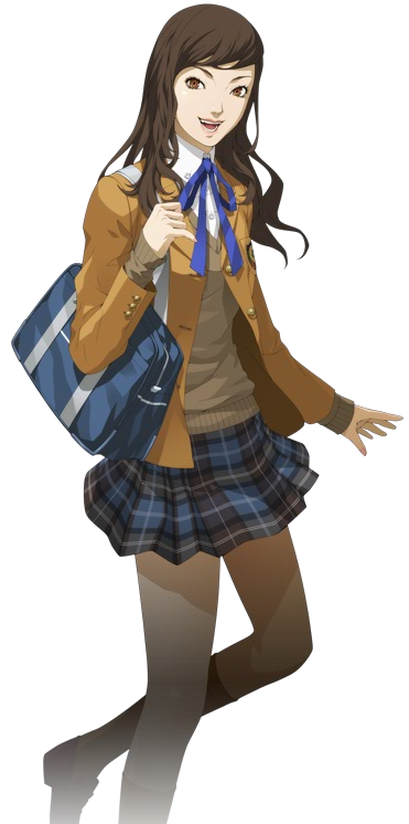
| Shin Megami Tensei IV: Apocalypse / 真・女神転生IV FINAL |
Eirikr: Yeah, and if SMT4 is Under the Knife 2,
then SMT4A is most certainly Trauma Team.
Soren: Exactly. Things were not looking up from the very
first ugly green promo collage.
Eirikr: Yeah, that thing. I couldn't believe what I was
seeing that morning when it first broke. It was like the first guest artist demon Famitsu spread for SMT4 with Isabeau and Asmodeus--downright appalling.
Soren: It was a lot to take in. I think the only
unquestionably good thing in this image is Sukuna-Hikona hiding in the corner
there.
Eirikr: And that hint of Adramelech.
Soren: Yes, couldn’t make him out at the time, but glad
he's in there somewhere.
Eirikr: By the time the first round of news was complete,
I was still worried that Sukuna-Hikona was going to be Stolas or something.
 |
| The very green, very disconcerting SMT4A announcement collage |
Eirikr: Puke green was an appropriate choice, I think.
Soren: Mercifully not incorporated into the actual UI.
Soren: Oh lord, yes. This is a pretty useful time
capsule!
Eirikr: I even mention the Isabeau/Asmodeus Famitsu
pages. That feature freakin’ traumatized me.
Soren: Yes, the thing has an unfortunate sort of staying
power to it.
Eirikr: I sure was reaching with the Dagda/Lugh thing,
though.
Soren: And of course the latter wasn't even in the
fucking game.
Eirikr: Lugh gets no respect, maybe because he was already in Devil Survivor 2. But speaking of, it was common to see SMT4A's cast compared to the general look of Devil Survivor, which I think is appropriate.
 |
| The supporting cast, in sprite form |
Soren: Yeah, and practically the same colors are utilized. Nozomi is also a good encapsulation of the shift that occurred here
Eirikr: Poor Nozomi. She was always going to be a
step down from her awesome original sprite that exuded more authentic character
than whatever inane “big sister” personality they gave her in SMT4A. I mean, of
course she was made a little sexier with a bust increase (keep in mind what I
said about nadeshiko and cup sizes in the Trauma Team section!). But what
is up with her silly neon pince-nez glasses? And while she’s coded red, we’ve got
Nanashi in green per the main theme color, Asahi blue, Gaston white, Hallelujah
yellow/gray, Toki black/purple, and Navarre... also green. Seems redundant with
Nanashi there, but Navarre’s original Samurai scarf was green, so I suppose
there was no divorcing that color from him. Dear lord, all of this is dredging
up repressed memories of Tumblr arguments.
Soren: Things are still pretty fresh, unfortunately.
Eirikr: Even fresher for me since I just played through
the game again within the past two weeks. But what's something new we can say
about the character designs other than they fulfill various youth market and
otaku tropes? For one, the concept art from the artbook showed us a direction
never to be for (some) characters and most demons.
 |
| The Good and the... Less Good |
Soren: The adult Nanashi is probably the biggest leap
that occurred. Other characters generally fare worse in their concepts,
particularly Toki.
Eirikr: Oh god, the bowlegged Toki. Jesus. God. How did
this happen? How did we go from relatively grounded to that?
Soren: It's chilling evidence of what Doi is capable of.
And there's like, what, one new old guy who immediately bites it? fuck this
game
Eirikr: Peaks and valleys. And this is where so much of
this had to be out of Doi's hands. There's a quote of Yamai's somewhere where
he mentions that the ages of the party were deliberately lowered for some
half-assed reason (the real reason is money). [3]
 |
| Toki |
Soren: The green color scheme was secretly a cry for
help (and money).
Eirikr: We won't need to talk about the demons much here
because that will be exhaustively covered in the follow-up article to this
feature, but their designs were where you could most easily see that Doi was
just adhering to the needs of the scenario and those above him on the ladder.
Soren: Yeah, there would have to be some serious course
correction to bring things back on track here, but even if Doi has proven to be
capable of dialing back when necessary it's unlikely his compatriots share the
same capacity, or desire.
Eirikr: Apocalypse seems like a deliberate attempt at
demographic experimentation, and that’s why Toki is probably its best
representative. There's no getting around that a 14-year-old expresses her
sexual desire for the player protagonist. It's hard to see in the game, but
Toki's black bodysuit even has a flame emanating from around her nether
regions. And while Doi couldn't evade the script's assertions, he could have
maybe made some more tasteful choices. But amazingly, the final design was the
more tasteful option compared to the concept art.
Soren: Toki is an excellent distillation of the failures
of both Doi and the scenario team in this case. I initially mistook her masked
figure in that promo image for a Hannya design, but it wasn’t until much later
that I would curse my lack of foresight on the matter.
 |
| Absolutely Not Lloyd Wilkens and Toki |
Soren: Jeez, yeah. Of all the ways for New Blood to
bleed into Apocalypse, it had to be a mask.
Eirikr: What can we say, Doi just hates drawing actual
human expressions. But beyond the masks and
hackneyed palettes, the main characters all have soft and smooth faces sans
much shading, though that's probably due to their ages.
Soren: And Nanashi, Asahi, and Nozomi practically all
have the same face shape.
Eirikr: And it looks like you could mine for gold with
Toki's chin.
Soren: God, her too, really. While the shift between
each Trauma Center entry felt calculated, it feels like Doi is just barely even
trying here.
Eirikr: Manabu looks like he belongs more in Soul Hackers
than the supposed oppressive environment of subterranean Tokyo.
Soren: There's a thriving Rasta subculture in this world
that hasn't seen the sun in 25 years, apparently. And he's supposed to be 18?
What the hell..?
 |
| Not Pictured: 7 years worth of artistic evolution |
Soren: Yes, when it comes to the demon compendium Doi employs what he calls his "heavy brush" (厚塗り) style in place of the appropriately termed "animation cel style" (アニメ的なセル画調) applied to his human characters, a dichotomy that he helpfully outlines in his comments on the SMT4 boxart. [1d] Doi approached Demeter in almost exactly the
same manner he would treat any young female character.
Eirikr: He mentions it directly in the Demeter commentary: "Looks-wise, I was expected to give her more of a an actual character touch than
have her look like a demon, similar to SMT4[A]'s Krishna.”
Soren: The reasoning seems to be that they wanted
to emphasize their role as characters in the narrative over their significance
as mythological figures, which certainly checks out with their modern approach
to this shit.
 |
| "Anime" (left) and "heavy" (right) Rei Reiho |
Soren: Yeah, that was right when he was developing his own "heavy brush" style, so you can see plenty of pieces that belong to both modes in there. Of course it would become the definitive look in short order, to such an extent that Doi employs his own take specifically to evoke that "Megaten" vibe, as he explains.
Eirikr: Yeah, Kaneko's demons from Soul Hackers onward would particularly be defined by the "heavy brush."
 |
| Prime examples of Doi's own "anime" and "heavy brush" styles: the flat, clean Krishna versus the gradated and textured Adramelech |
Eirikr: Heck yeah, we definitely need to make a shoutout to Shiraishi. Without her it would've been Soejima doing all that heavy brush lifting! But shifting gears back to our subject, I want to reiterate that Doi wasn’t behind the underwhelming crew portraits for Strange Journey Redux.
Soren: Yes, the blame for the crew portraits can be
heaped squarely on Odagaki. Sort of like if they had brought in Ikehata to sub for Doi instead of vice-versa.
Eirikr:
Worth noting also that Doi didn’t draw any of the
sometimes shoddy cutscene artwork in SMT4A--it was done by Ikumi Fukuda,
who
was also behind the Demonic Gene SMT4 manga. But before we begin to wrap things up here, we previously mentioned the correspondence between the rainbow-colored anime
casts of Apocalypse and Trauma Team, but didn’t touch on how analogous the dominant Samurai
uniform in
SMT4 is to the doctors’ white coats seen throughout Trauma Center.
 |
| Unfortunate, but not Doi: Akira Odagaki (left) and Ikumi Fukuda (right) |
Soren: In both cases a particular uniform dominates the look of the main cast, but Doi manages to set each character apart from one another in meaningful, if sometimes slight, ways. It's hardly rare for limitation to foster creativity, but this sort of inherently restrained framework seems to compliment his abilities nicely.
Doi's Our Boy... for the Foreseeable Future
Eirikr: So one final topic: Shin Megami Tensei V is impending and so far we’ve
got a guy, a girl, and a pitchfork-wielding demon. The last of which I hope is
just a generic “Demon” unit so we can know just how out-of-touch Atlus Japan is with Atlus USA.
Soren: That's what I'm hedging my bets on at the moment.
But yeah, another link in the chain to explore.
Eirikr: The fact that it’s a whole group of them, too.
But petal suit dude doesn’t instill much confidence, though it’s doubtful that
guy will wear it for the whole game.
 |
| Party Time! |
Eirikr: It’s so ugly! And we haven’t even seen it from
the front, yet!
Soren: Yeah, hopefully he'll undergo a wardrobe change
after being... eaten by demons? That usually does the trick.
Eirikr: I can’t shake off the petal motif being part of
his body (or some visual metaphor for blood, like Nocturne's Magatsuhi), either, after being saved by this game’s Lucifer/Dagda equivalent.
Soren: I imagine it'll persist in some form, but how
clumsily that motif is employed has yet to be seen, so my modest hope is
"not quite so clumsily this time.”
Eirikr: Be nice if it had to do with the world instead of
a character. And there’s not much to go on for his girlfriend. Even beyond the
design, I feel she will persist in the game in some stereotypical and intrusive
form. That’s assuming she’s not the protagonist--we of course don’t know for
sure yet! But it was Doi after all who towed the company line with the “men are
better suited for apocalypses” shit. [4]
Soren: With that in mind, maybe she'll just bite it
early to fuel his manpain. The possibilities are endless!
Eirikr: Well, Devilman is en vogue once again, but we’ll
see, we’ll see!
 |
| (L-to-R) Famitsu Cover Illustration, Famitsu 30th Anniversary, and Persona Series 20th Anniversary |
Soren: One last potentiality worth noting is a new style
Doi seems to be experimenting with, exemplified in this promotional piece for
SMT4A, a 20th anniversary sketch of Maya, and a recent image of Chun-Li
celebrating Famitsu’s own 30th anniversary. All exhibit radically different coloring from even his other contemporary work, and the more pronounced glossy
highlights on their faces seem to evoke the same flourish you catch in anime every
now and then.
Eirikr: Yeah, this was unexpected. It’s not what I’d
prefer to see out of Doi, which would be the New Blood style, but it’s the kind
of variety and experimentation I can stand behind. Though doesn’t Soejima
sometimes illustrate in a similarly simpler style? I can feel that being part
of the influence at play.
Soren: Soejima changes it up often enough that it’s hard
to say where the dominant influence might come from, but I wouldn’t be
surprised if Doi pulls from him going forward. It would continue to justify our
earlier confusion, anyway. I at least doubt this’ll be the prominent look for Shin Megami Tensei V's art direction, but maybe for a spin-off or something. Get some mileage out
of that variety.
Eirikr: Yeah, I’m definitely open to it cropping up
again. The bottom line is that I like Doi; he seems like an interesting,
talented fellow.
Soren: Right, if anything this discussion has given me a
better appreciation for his abilities as an artist and designer, even if the
trajectory hasn't been the most encouraging.
Eirikr: I just don’t think Atlus is necessarily making
the best use of him. In many cases his talent is being squandered as he is
being strong-armed into delivering visions that aren’t entirely his own, as he
seems pretty divorced from the producing and planning side of things. Something
Kaneko was intimate with, given his seniority.
Soren: Atlus doesn't seem like the best place for
artistic talent to thrive at the moment, no. Early signs suggest that SMT4A will
prove less of an evolutionary dead end than Trauma Team, but Doi is still capable
of some good work, even under dire circumstances. Not the best prognostics, but
we'll see how it all pans out going forward!
Eirikr: Yeah, and as we’ll find out in the follow-up
article about Doi's Odin and other demons, even when he is given
more artistic freedom he’s prone to making poor or inappropriate choices.
Despite that and any criticisms, Doi is a guy I want to root for. I think he’d
benefit from having a greater role in the creative process.
NEXT: Doi inherits the "Demon Painter" title... but are his designs an Ultra Hit or Ultra Miss?

__________________________
NEXT: Doi inherits the "Demon Painter" title... but are his designs an Ultra Hit or Ultra Miss?
__________________________
Special thanks to:
- Dijeh: We honestly can't think of anything specific, but just assume that Dijeh had some impact on this article, as usual.
- The Caduceus Database: For maintaining a muted enthusiasm for the Trauma series and ensuring we had the art we needed.
- Opendork's Trauma Center: New Blood LP: When we needed some backgrounders.
- Seventhdoctor: Trauma Team artbook scans!
References:
[1] Shin Megami Tensei IV: Official Artworks. Udon Entertainment, 2016.
[2] The Art of Persona 5. Prima Games, 2017.
“Things went smoothly after we locked down her character, but the first images drawn were not all that cute, so Director Hashino suggested that we 'make her cuter' and strongly demanded that we 'stop drawing nostrils on her.'"
[1] Shin Megami Tensei IV: Official Artworks. Udon Entertainment, 2016.
- [1a] “It was a really interesting interview, but I was nervous as could be. Afterward, I found myself appreciating Kaneko-san’s tendency to… how do I put it… judge me hard without any mercy. (laughs)”
- [1b] “Even the Samurai cosplay outfits for our booth were made through a collaboration between myself and an actual garment maker. During their production, I started interfering with aspects that a person in my role normally wouldn’t, saying things like “I think these sleeves should be more like this,” and making other requests. The garment maker said, “Wait, do you have a background in fashion?” (laughs) Everything proceeded smoothly after that.”
- [1c] “But then, his unique hairstyle gives him a bit of individuality. There were pros and cons to that choice, and I designed his hair assuming there would be some pushback.”
- [1d] "On a technical level, although most of my illustrations are done in animation cel style, I challenged myself to do this one with heavy brush techniques in order to fit with the 'MegaTen' series' image and worldview."
 |
| Fixed those unsightly nostrils for you, Mr. Hashino! |
“Things went smoothly after we locked down her character, but the first images drawn were not all that cute, so Director Hashino suggested that we 'make her cuter' and strongly demanded that we 'stop drawing nostrils on her.'"
[3] “Actually in the early phases of planning, we planned to have the main character to be even older than SMT4’s… if we’re making a simulator based on current era, rather than an adult with an almost complete self, it’s much better for a main character of a current-era Megaten to be incomplete children with some doubts in their hearts.” Translated by Nintendo Everything.
[4] “Because the game is
more about survival, on average male figures have a better chance to survive
than females that’s why the games lean towards more male characters.” Making Law and Chaos Heroes, Siliconera.
This was great! I especially appreciated the examination of Trauma Center, I don't see that series brought up much in ATLUS discussions. Looking forward to the Doi article July 4th
ReplyDeleteThis is good! looking forward for your commentary on demon designs!
ReplyDeleteTo be honest, I actually dig his designs for new blood. I think his art style fits with trauma team than megaten though... :d
(btw, I'm Duckpasta from the talking time forum. haha.. :p)
This was an excellent read, thanks!
ReplyDeleteRegarding Flynn's triangular hair, it's pretty reminiscent to Kaneko's Serph for Digital Devil Saga in my opinion.
Don't forget Hikawa's hair too :p
DeleteHikawa is just vegeta lol
Delete